


Overview
Context
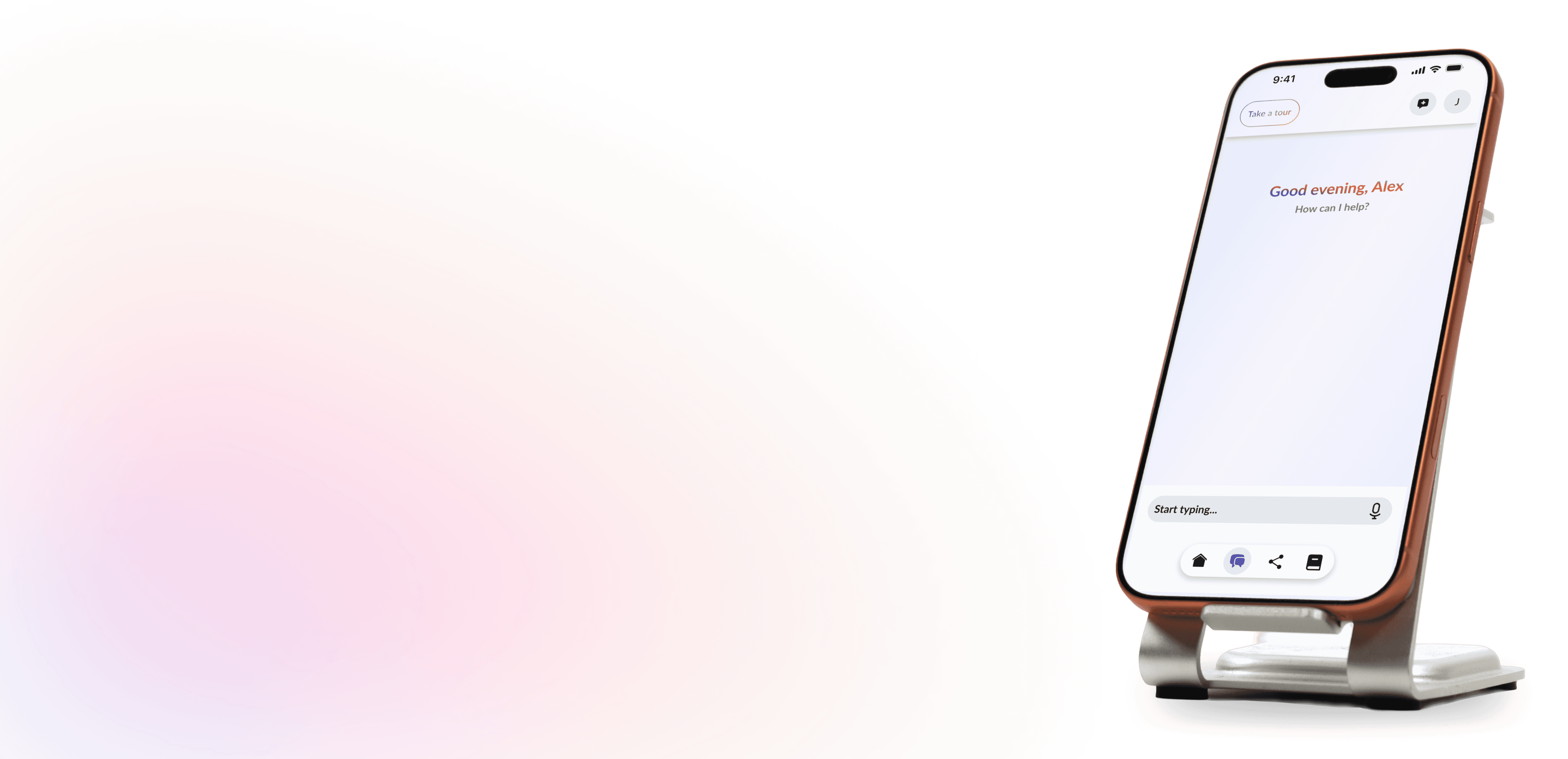
OxeAI is an AI-driven wellness app that empowers users to plan, track, and uncover meaningful trends across their health — spanning fitness, nutrition, hydration, sleep, and overall wellness topics such as sleep, mood, and stress.
OxeAI also represents a strategic expansion of OxeFit beyond its original focus in exclusively fitness-focused physical and digital products.
I served as the lead UX/UI designer for OxeAI's launch , responsible for all branding, screen designs, design system implementation, research, across mobile and web versions.
The Problem Brief
1.
Provide a meaningful user experience across physical, mental, and emotional health related to a user's health and wellness.
2.
Take disconnected wellness data and life patterns, understand it in context, and provide simple, personalized guidance.
3.
Provide an interactive, low-friction, open-ended AI chat experience that, within reason, replicates interaction with a personal assistant or fitness instructor.
4.
Allow user to create plans that align and continually adapt with their goals, experience, and lifestyle.
Target Market
Busy Professionals: People who want simple, actionable plans without tracking and logging fatigue..
Health-Conscious Consumers: Those who want balance between physical health, emotional health, and lifestyle.
Wearable Users: Owners of products such as Apple Watch, Oura, WHOOP, or Garmin, but need contextual guidance.
Fitness-Oriented Users: Those that care deeply about performance, strength, energy levels, and physical readiness.
Discovery
Competitive Analysis
In analyzing the competitive landscape I separated them into 3 primary categories
AI Chat Assistants (Mental Health & Learning)


Fitness & Nutrition AI


Lifestyle & Wearables


The Good
Clinical & Evidence-Based Value
• Users highly appreciate apps that leverage evidence-based methods from clinical studies
• Incorporating non-judgmental, conversational tones makes experiences feel safe and engaging
Gamification & Bite-Sized Content
• Brief, engaging lessons with gamified and interactive formats are perfect for beginners and busy schedules .
• Bright visuals, intuitive progress tracking, and milestone markers keep users motivated.
Actionable Biometrics & Health Insights
• Long-term trend charts and correlations (such as sleep vs. recovery vs. readiness) are highly valued for spotting early health changes.
Accessibility & Community Integration
• Features like vocal recognition greatly improve accessibility .
• Integrating social hooks, community spaces, and connections to live coaches drives strong accountability.
The Not So Good
Rigid AI & Scripted Conversational Loops
• AI chatbots frequently feel restrictive, robotic, or scripted .
• System guardrails often misinterpret user inputs, causing frustrating or bizarre responses.
The "Fresh Start" Amnesia
• Many chatbots do not keep a detailed chat history, forcing a completely fresh conversation from scratch every time the app opens.
Lack of Deep Explanations & Customization
• Gamified or simple setups often cater only to beginners, leaving advanced users unsatisfied with light explanations and a lack of nuanced variations.
Isolated AI & Data Silos
• Conversational AI often fails to sync with the rest of the app; talking to the AI frequently does not update the core dashboard metrics.
Opportunities to Solve
"Conversational Memory" UI: Design an AI chatbot interface that retains historical context seamlessly across separate dates, allowing users to reference a meal or mental breakthrough from weeks ago without polluting their current view.
Multi-Modal AI Integration: Create a fitness interface where text prompts instantly generate visual outputs (e.g., typing "Show me how to fix my squat form" triggers a synchronized video demonstration alongside real-time kinetic adjustments
Anti-Silo System: Design an architecture where talking to an AI assistant quickly alters the physical metrics, goals, and layout of the core application dashboard without requiring excessive manual data entry.
Design
Design 1/4: The Categories
OxeAI is intended to be an all-in-one experience, offering comprehensive access to better health across 6 primary categories.
ACTIVITY
Generated long-term workout plans, activity metrics tracking, and workout stepper
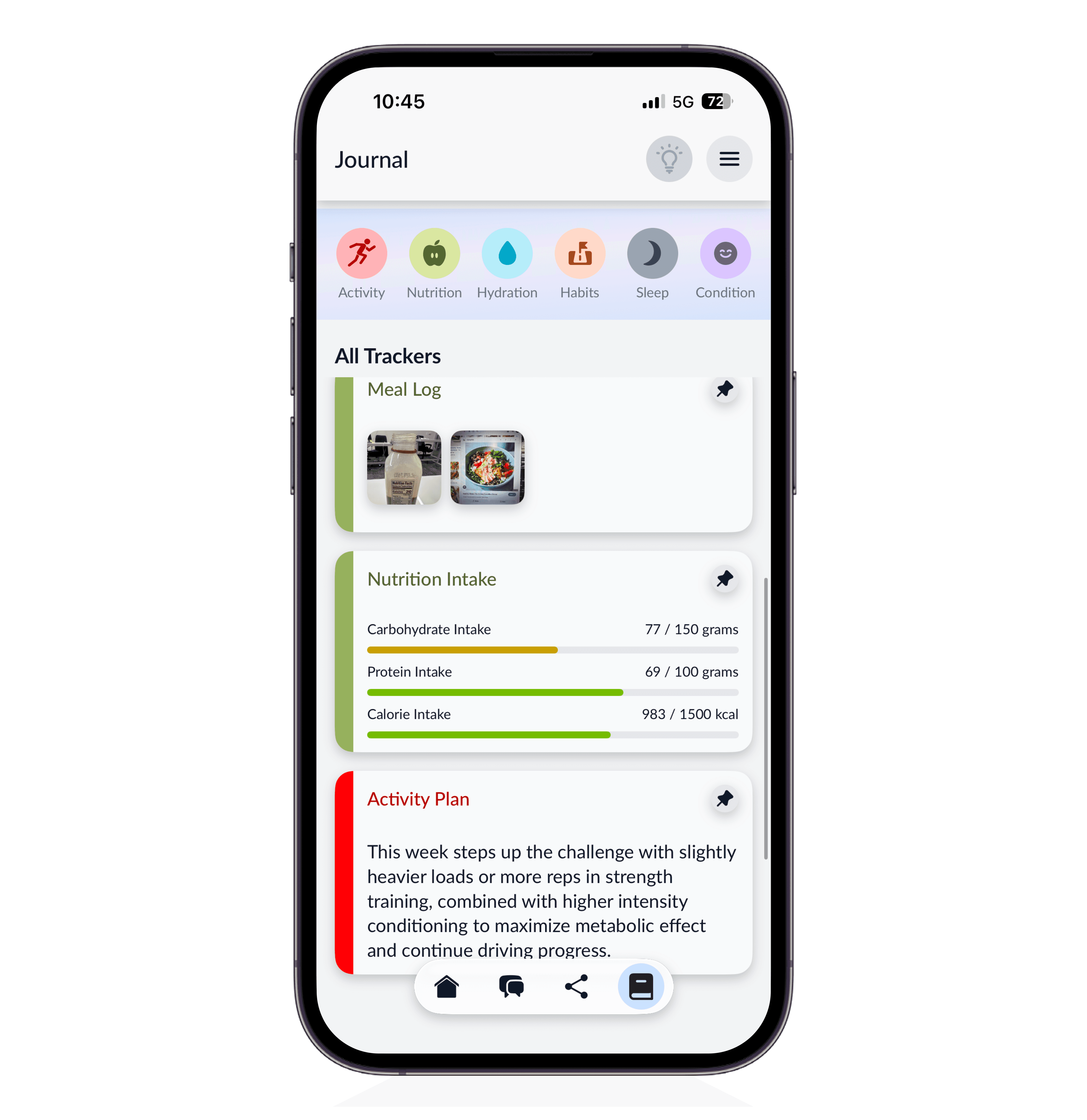
NUTRITION
Photo and chat-based meal logging, nutrition metrics, and long-term nutrition plans with personalized meals.
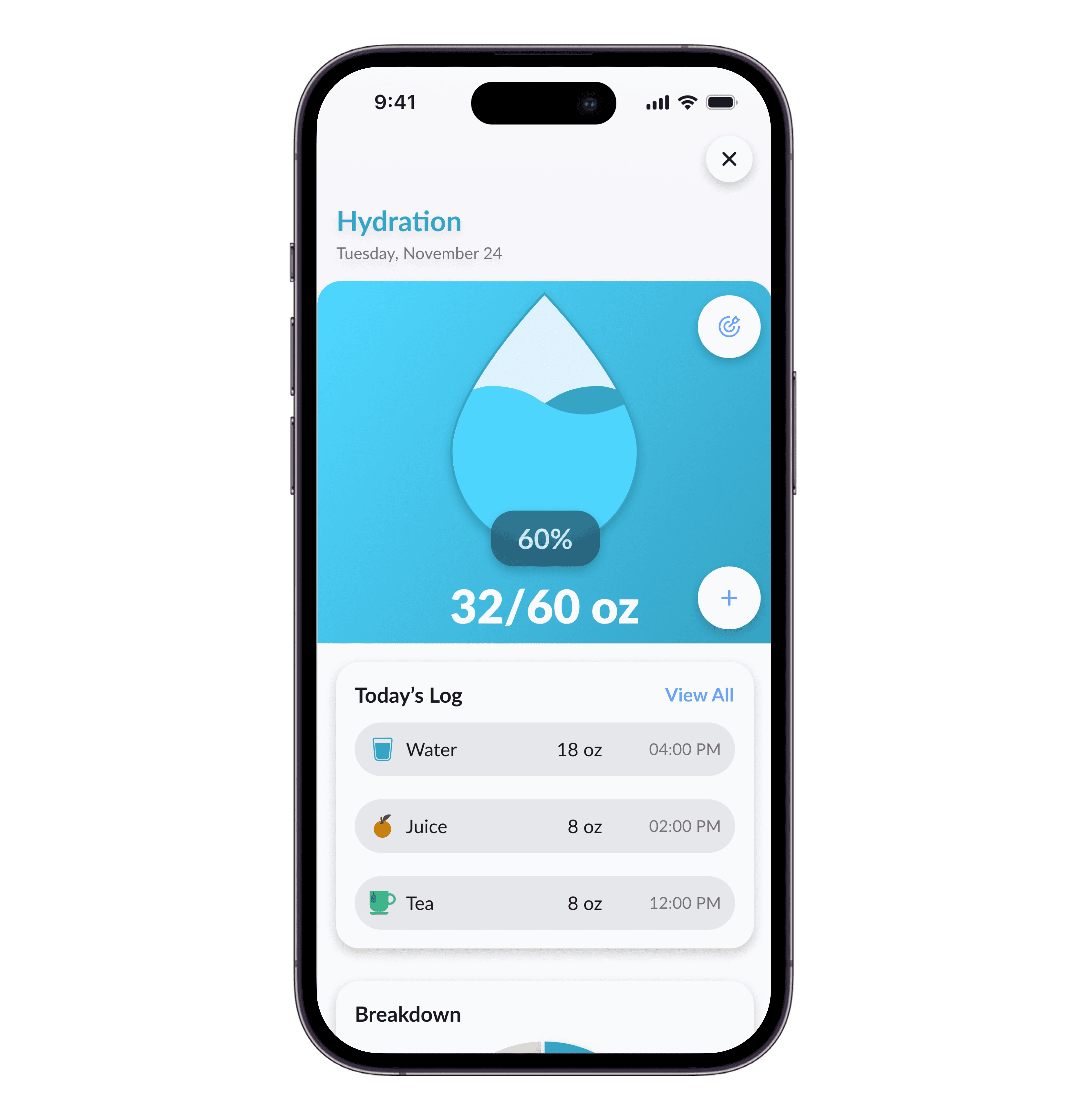
HYDRATION
Quick drink logging, breakdowns by drink type, and health impact analysis.


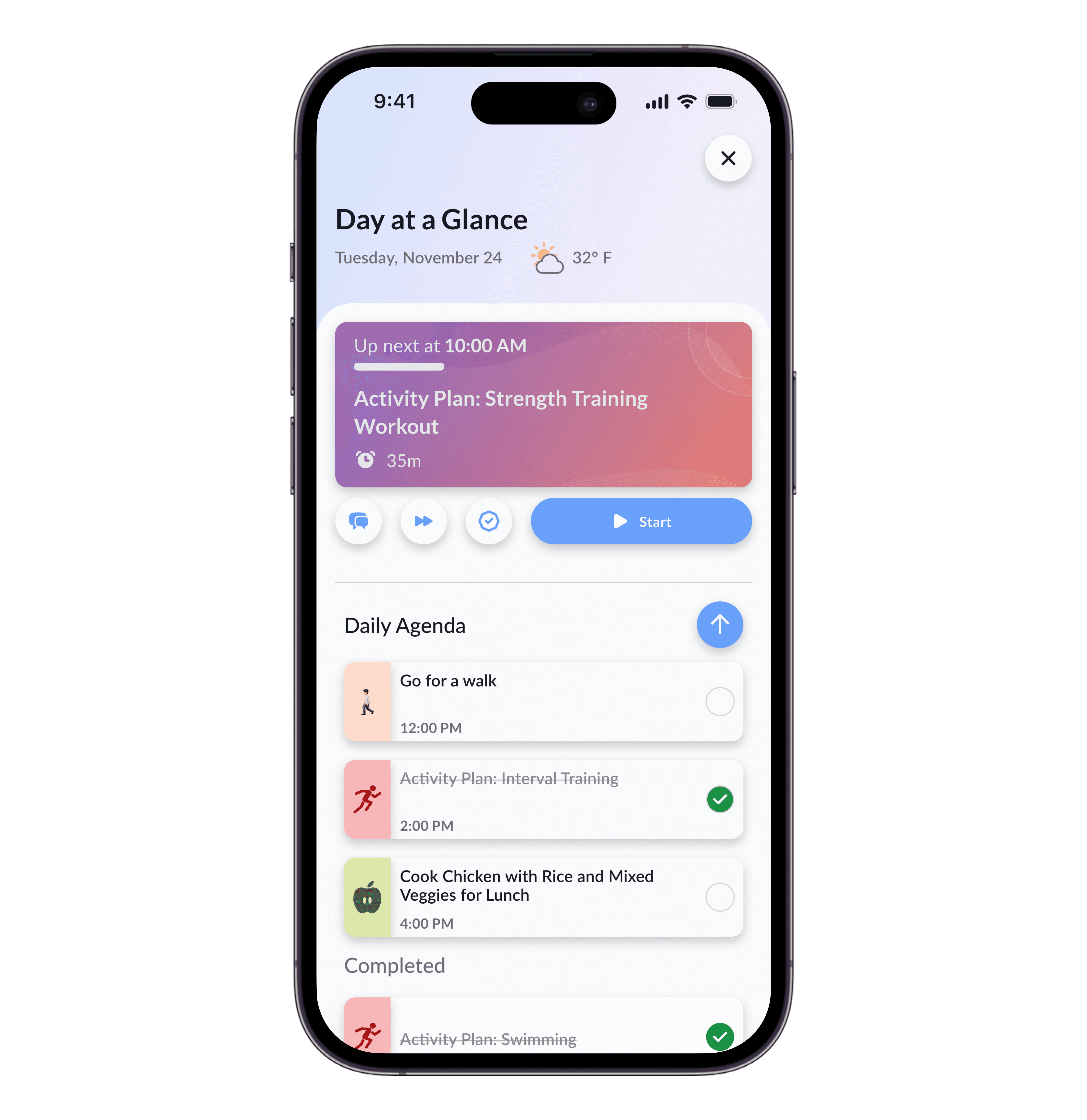
HABITS
Customizable habit tracking and a detailed daily agenda allowing a user to build their day as they choose.
SLEEP
Currently OxeAI only offers tracking for sleep quality and sleep duration, but work is underway to expand this area!
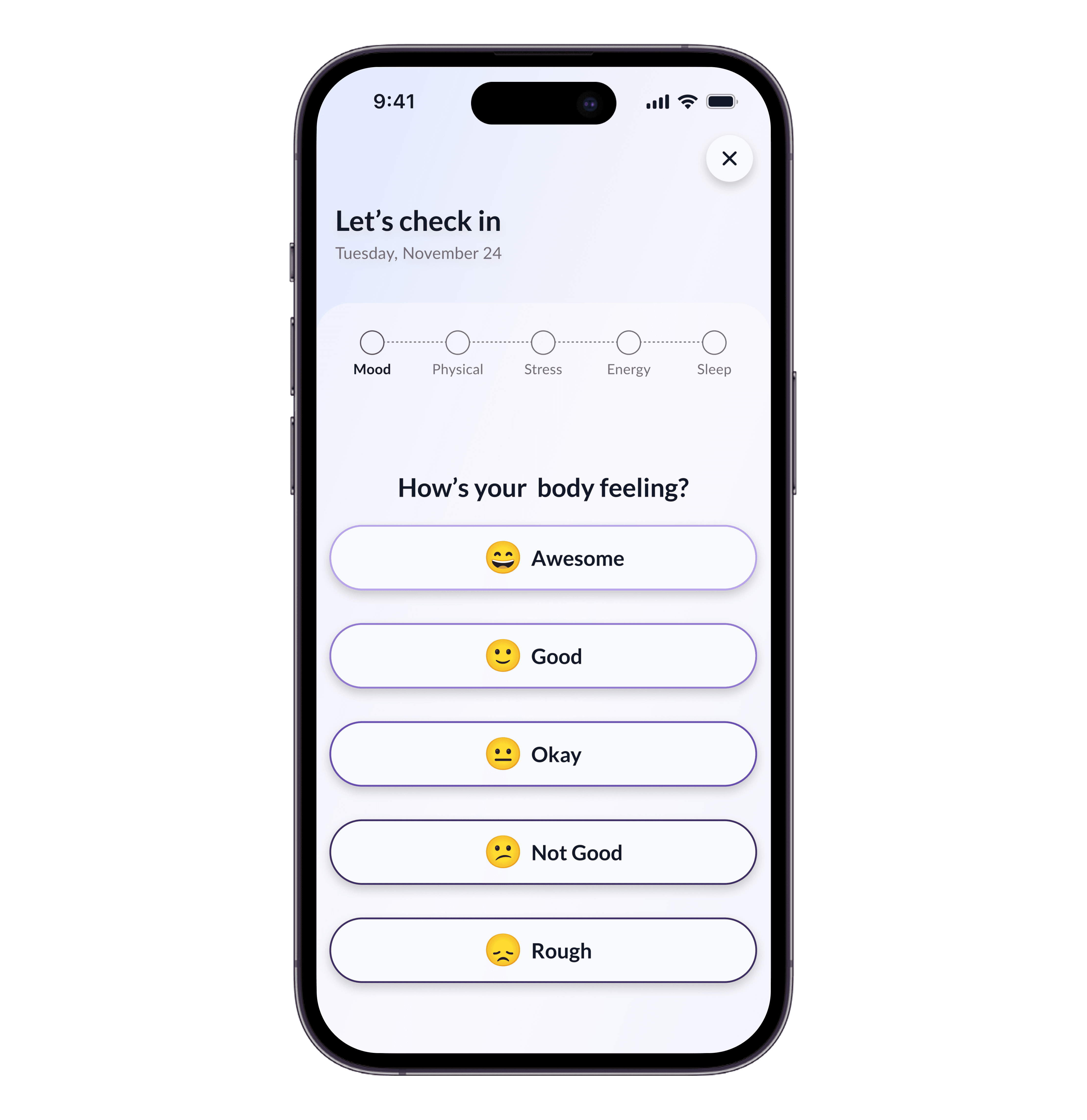
CONDITION
Holistic tracking a user's mental and physical wellbeing through check-ins and conversation memory.
Design 2/4: Guidance & Insights

Daily Guidance
OxeAI provides recommendations for change based on a user's progress, prompts discussion on trends it notices, and encourages updates to a user's schedule if they continually miss a task.
As Guidance is intended to be a user's guiding light for their overall health trends and trajectories, it is placed first and foremost on their home screen.
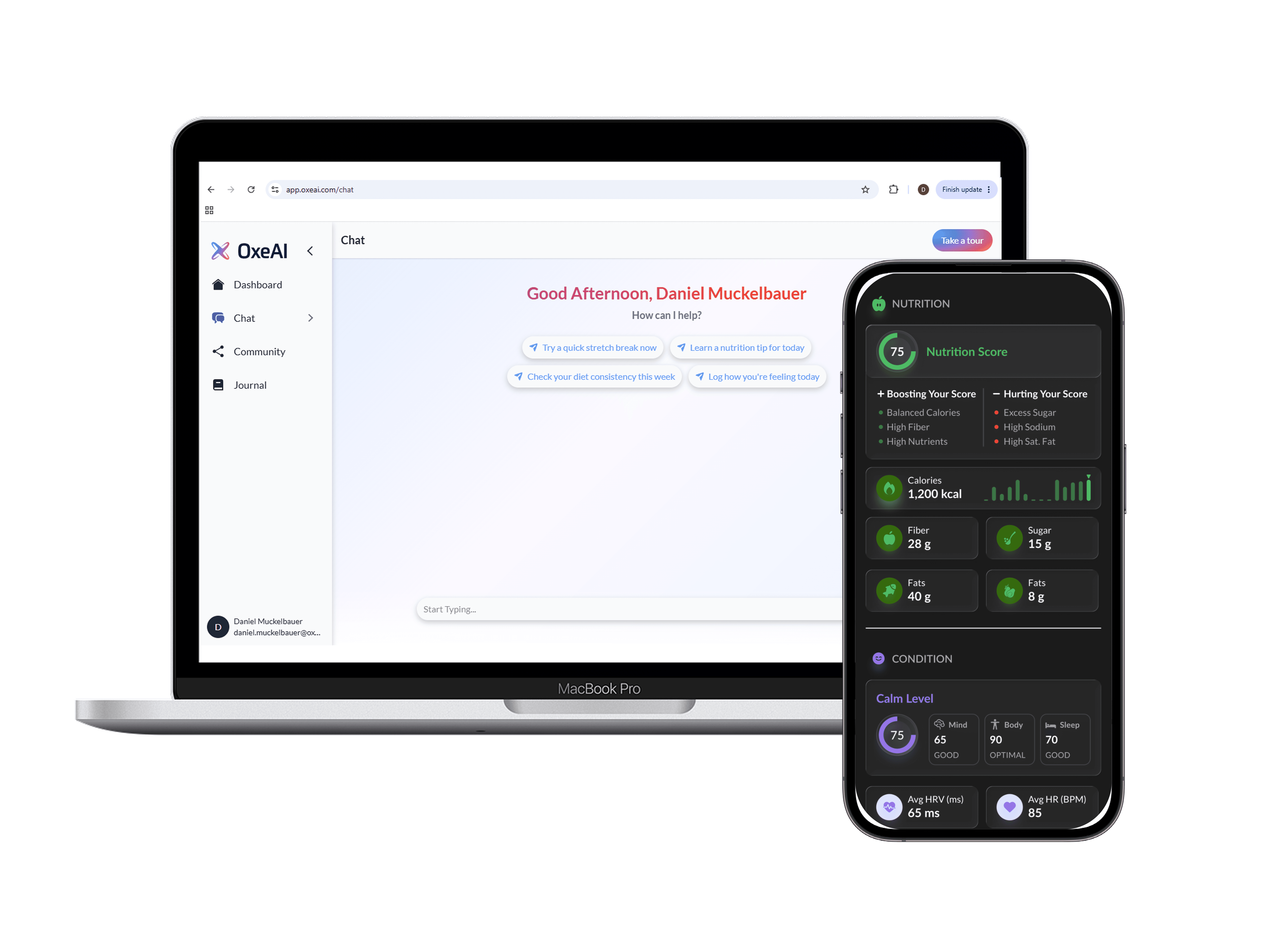
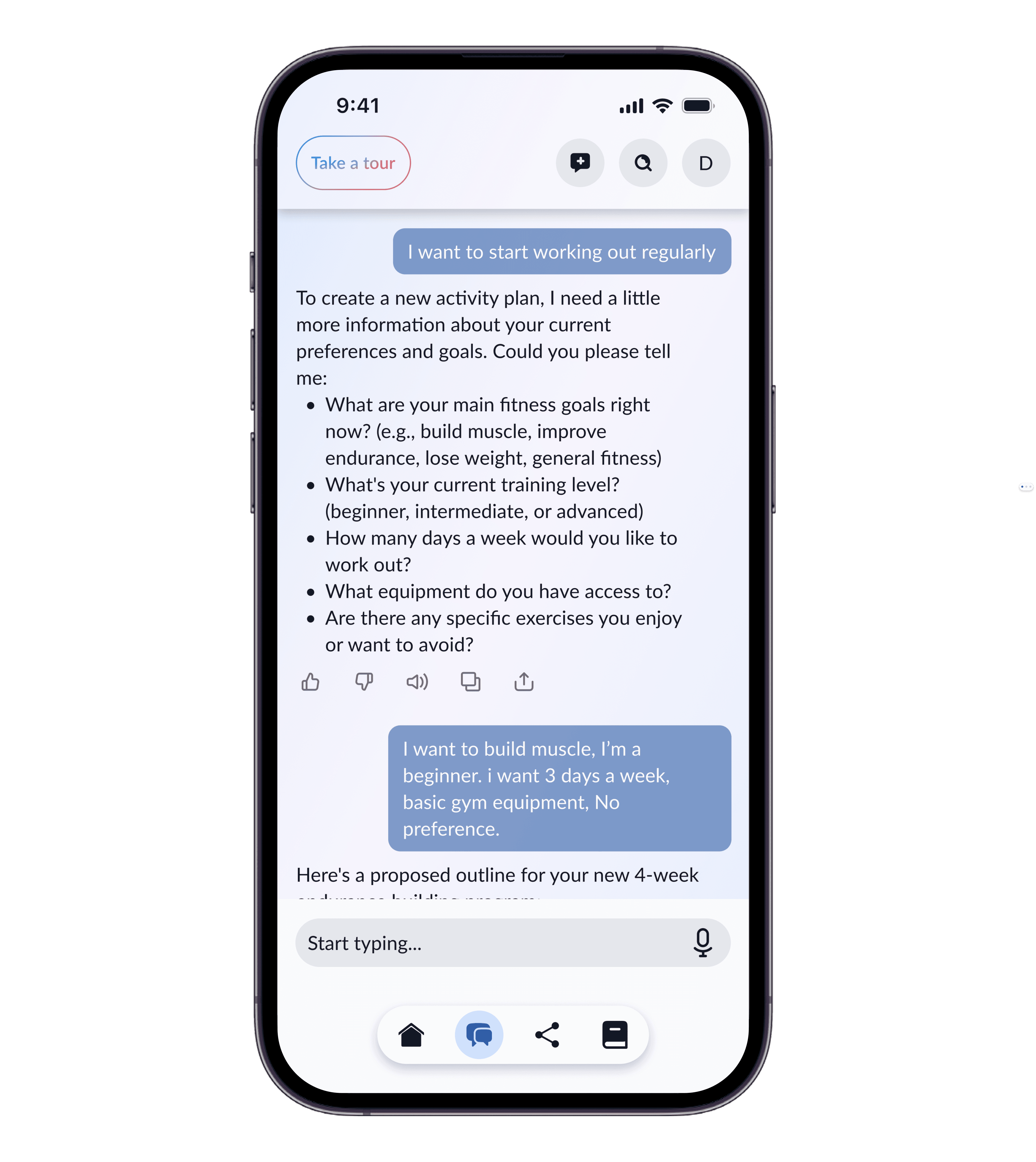
Design 3/4: The Chat
The core functionality of OxeAI revolves around the eponymous AI itself. Rather than splitting into many sessions based on topic, as is the approach of mainstream AI apps such as ChatGPT, or introducing AI as an additional tool, OxeAI is intended to be the core driver for user interactions.

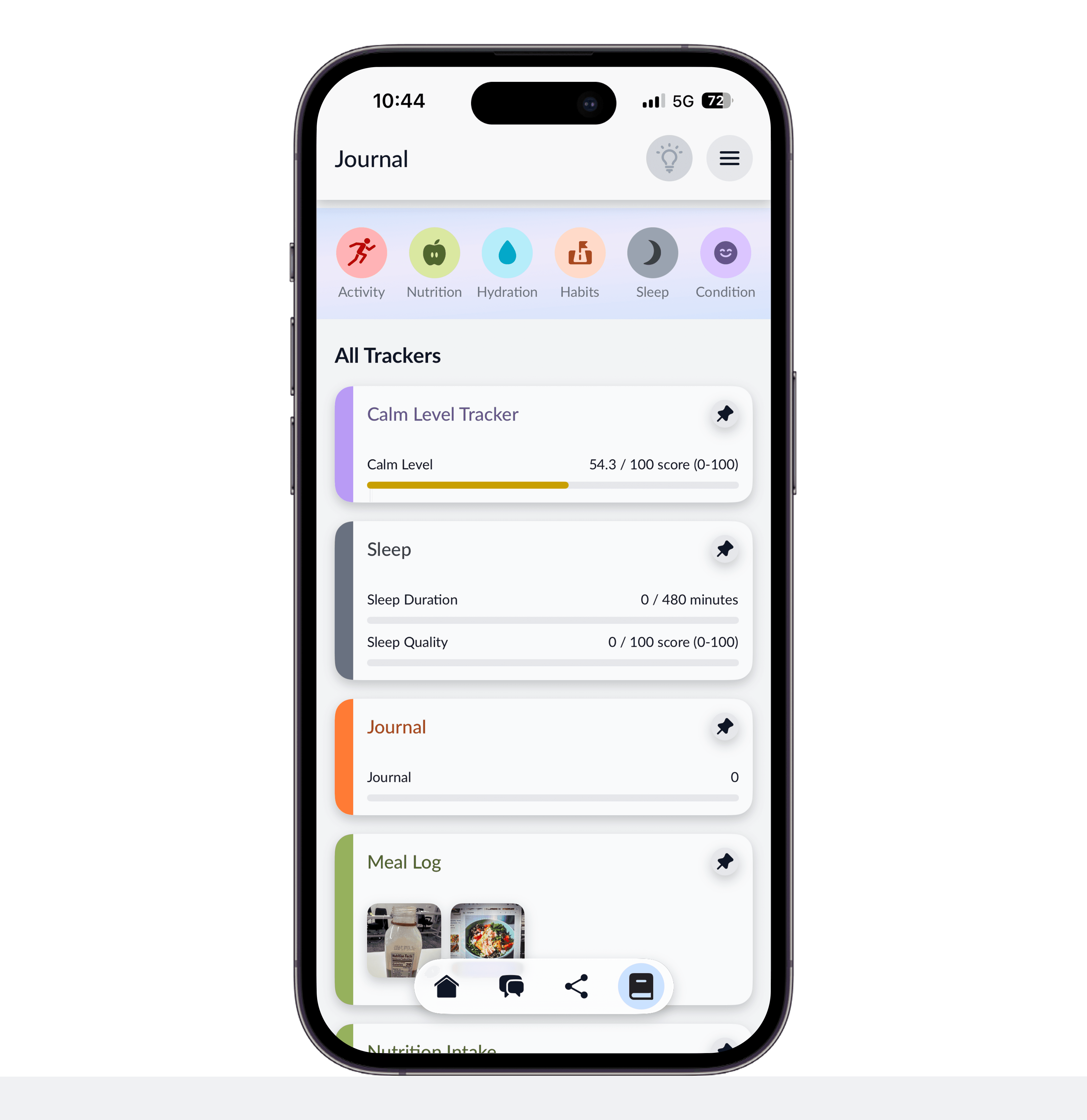
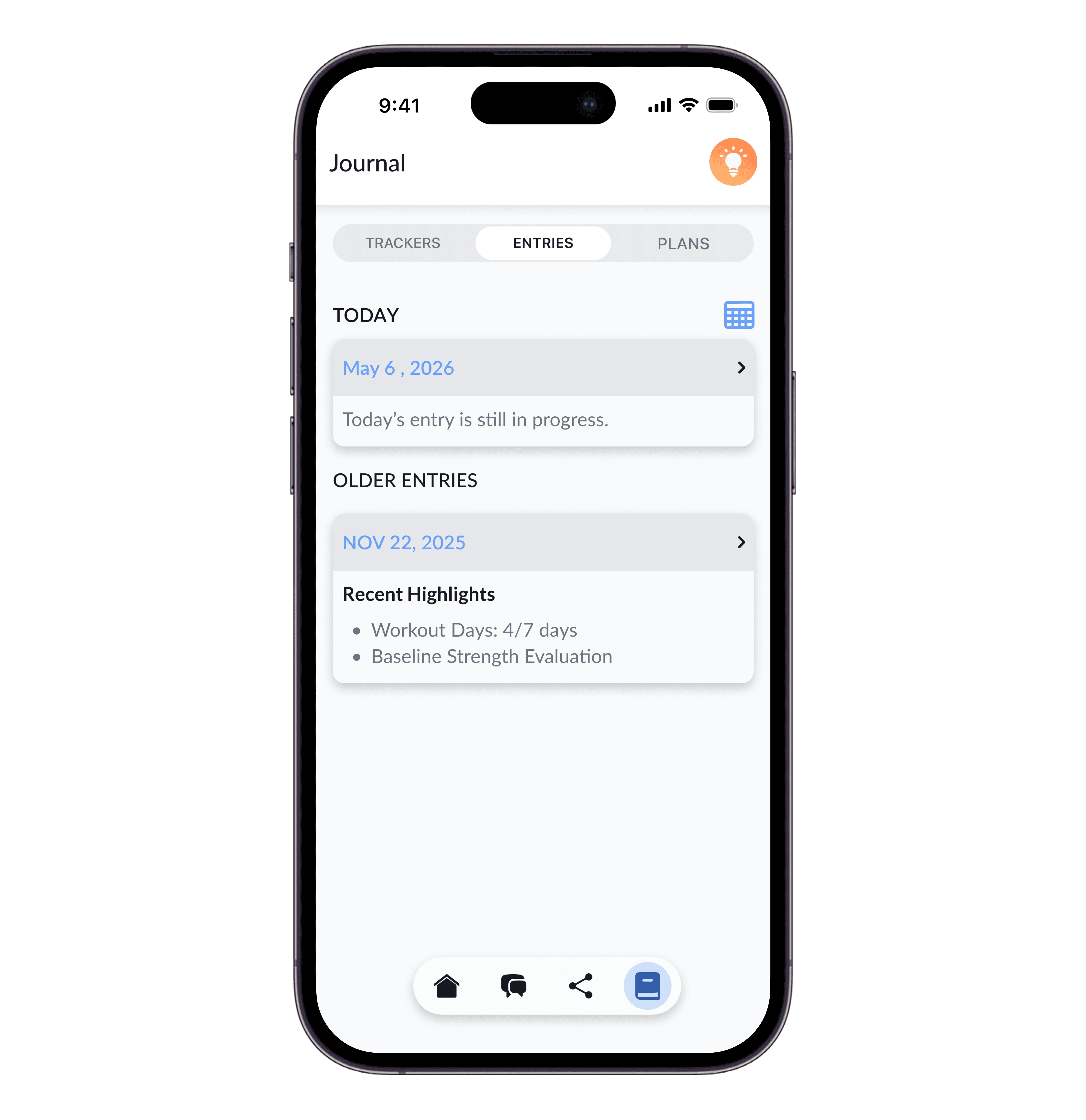
Design 4/4: The Journal
SNAPSHOT
A landing screen for users to jump into chatting, see prioritized tracking, and review today's events
TRACKING
Goal and survey based data tracking across 6 main categories in widgets called "Trackers".
ENTRIES
A recorded history of a user's accomplishments, changes, and chat sessions.
PLANS
Dynamic AI-generated fitness and nutrition plans that update automatically over time or based on the user's requests.


Key Decision: Improving App Navigation
The Solution
Based on pre-launch user testing we identified some weak points in the journal's structure
Snapshot page had become unnecessary as a result of AI cost limitations and time constraints
The information architecture within the journal was overly complex, with multiple redundant entry points and a weak hierarchy
Plans and trackers needed a clearer separation as they served they were too difficult to sort through within the same tab
SNAPSHOT
Due to features being removed from scope or moved elsewhere, this screen became unnecessary.
TRACKING
Dropdown menu was removed and replaced with a tabbed view
Filtering updated to include 'All' Trackers
ENTRIES
Moved from dropdown to tabbed view. No major changes.
PLANS
Separated from Trackers to emphasize their use and make them easier to find


Outcomes
Key Metrics: 1 Month Post-Release
FROM FIGMA TO DEVELOPMENT
1000+ Screens
BUILDING THE ARCHITECTURE
500+ Reusable Tokens and Components
FROM CONCEPT TO LAUNCH
8 Months
APP STORE RATING
4.4/5
PLATFORMS SHIPPED
iOS / Android/ Web
DOWNLOAD TO PURCHASE RATE
10%
90th Percentile among mobile apps globally
Final Thoughts
What I'm working on now
1.
IMPROVED ONBOARDING
Rebuilding the launch experience to guide users toward the features most relevant to them — segmented by preference (fitness vs. nutrition focus) and by usage style (following AI-generated plans vs. self-directed tracking). The goal is a more intentional entry point that reduces overwhelm and surfaces value faster.
2.
EXPANDED COMMUNITY FEATURES
One of OxeAI's future focuses is to be a platform for sharing media based around in-app experiences such as completed workouts or meals, leaderboards based on accomplishments, and events. To accomplish this I'm working to expand the media sharing customization and general community feature set.
3.
IMPROVED METRICS & WEARABLE INTEGRATION
Deepening how wearable data is used by introducing additional metrics, health scoring, and clearer feedback loops that show users how their in-app and external device data translates into insights and trajectory.
What I'd do differently
Define a tighter feature set earlier. As a result of a decentralized approach to product ownership much of the product's scope and vision had to be uncovered iteratively during the project itself. This led to a breadth-over-depth problem — features that individually worked but lacked a cohesive connective tissue. A more defined north star and tighter MVP scope upfront would have produced a more coherent product.
Push harder for user research and testing. The project's timeline and engineering priorities — particularly the AI agent and data science infrastructure — compressed the time available for user testing, A/B testing, and iterative design validation. In future projects, I would advocate more assertively for research checkpoints, even within tight timelines. Better early insights would have surfaced the onboarding and discoverability issues before launch rather than after.
Tighter planning of app mapping. With a broader feature set comes greater need for rigorous information architecture work upfront. A more thorough app map and user flow documentation early on would have reduced ambiguity and helped align the team on how the pieces fit together.
User Feedback Themes
Some users struggled to find their footing in the app and found it unclear where best to start
Discovery of the full breadth of features was not conveneint to users
Wearable integration (smartwatch data collection) was not clearly communicated — users didn't know how to make best use of it